Say hello to Utrecht – unifying your user experience with powerful new visualisations, geo-mapping, and search alerts
Our Utrecht release presents users with new ways to visualise and navigate information insights, bringing the worlds of data and content together for a more unified experience. I spoke to product owner Sonia Chaudhry to find out how the latest spotlight features deliver value to Aiimi Insight Engine users against the backdrop of a rapidly growing data-driven market.
Hi Sonia. It looks like you and the team have been busy adding a range of new features to make our Insight Engine even more valuable for users. When’s the ‘Utrecht’ software release set to go live?
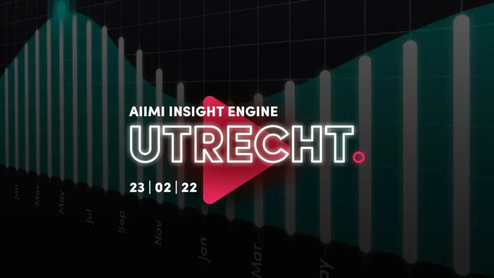
Hi Helen. Yes, you’re right. Here at Aiimi Labs, we’ve been developing even more value-driven features for our Aiimi Insight Engine. Set to launch on 23 February, Utrecht’s our first major release for 2022 – and we’re kick-starting the year from a visual viewpoint.
This software upgrade presents 13 new product features to support a more dynamic and immersive user journey. It introduces a range of visualisation tools to improve how information and search results are viewed by our Aiimi Insight Engine users. By accelerating and adding context to our user’s searches, their experience will become even more insightful.
Not only do we want to proactively serve and recommend information to our users based on their persona and interests, but we also want to offer them diverse ways of digesting and navigating their data-driven insights. Ultimately, this will support more effective and informed decision making.
Can you reveal more about the Timeline Visualisation spotlight feature – and how it helps our Aiimi Insight Engine customers?
Behind the scenes, the Aiimi Insight Engine automatically crawls and enriches information, such as files and data records, across multiple source repositories and corporate systems. When a user is shown suggested search results, or is presented with a results set based on their interests or search query, they can now choose to view a Timeline Visualisation of related events that have occurred.
For example, if a user is viewing a data record relating to an employee, the visual timeline will reflect relevant events, like when a job role change took place. Similarly, if a user views a document, the timeline will show notable events, like when it was created, when it was modified, and whether the owner of that document has changed. This forms part of our overall roadmap to evolve this feature going forwards, helping organisations better manage their expanding estate of operational assets.
Plus, for each data record held on an asset base, users can now find out how that asset’s been maintained by viewing changes to its maintenance schedule status on a visual timeline. And within the goods manufacturing sector, users can now see how an item’s transitioned through each stage of the production lifecycle, targeting improvements where needed.
The timeline visualisation is also going to add a lot of value from a compliance and investigatory use case perspective. It will help our users detect fraudulent activities, such as organisations becoming private or public, and shows when individuals move from one company to another.
An added benefit is that it helps organisations spot outliers in their data. For example, exposing unpredicted random events that have occurred, which may otherwise have remained unknown and hidden.
And the Histogram Visualisation tool – how is that different?
When users are searching for information to support a task at hand, they may well be presented with a vast number of search results. The Histogram Visualisation tool plots these search results according to insightful information, such as when a data record or file was created or modified across a specified timeframe, whether that’s the previous five years or just six months. This new approach to visualising search results layers added context, making the user experience more perceptive.
This feature is valuable because it shows time periods when lots of activity has occurred in respect to when a piece of information is created or updated, within the context of the specific search and scenario. This brings to attention any trends, patterns, and outliers in data that may indicate suspicious or non-compliant behaviour. By displaying when pockets of knowledge have been captured, it also helps promote knowledge sharing between teams and departments.
A real-world application of the Histogram Visualisation could relate to instances of faulty goods. Manufacturing or engineering firms can easily discover when customers most frequently report a faulty item or return a purchase. By capturing this information as a data record or document, the histogram visualises spikes to show high activity.
Can you tell me more about Map View? How does it help users?
Building on the Timeline and Histogram Visualisation tools, the Map View feature intelligently plots information relating to a user’s topic of interest or search query on a geographical map. In practice, the Aiimi Insight Engine first enriches addresses or geo-points captured in data records and documents held across corporate systems, before enabling them to be overlayed onto a Map View.
This is particularly useful to suppliers looking to find out where their customers are located. Organisations could use this feature to plot their customers geographically, using data held in customer records management (CRM) systems. And then overlay this with related files, like contractual or financial information.
Using the easy-to-navigate Map View, users can navigate a wide range of search results, and then select the most relevant information for preview. Whether this is a document or data record, users can delve deeper into its metadata, which is extracted during enrichment, to find out more.
What about the second set of spotlight features – Cascading Searches and Alerting on a Saved Search? What do they bring to the equation?
The Cascading Searches feature empowers users to more easily trigger a new search, following on from their initial search. Or users can further refine their existing search by cherry picking metadata terms (i.e., entities) from their search results to string together an entirely new search query. By gleaning insights from the information presented, users can avoid manually inputting new search queries, and instead swiftly refine and run a fresh search based on their existing search results.
For example, if a user is carrying out checks on employees for compliance and security reasons, the result set will show each employee’s date of birth, passport number, address, nationality, and job role. By selecting specific entities of interest, such as the passport number and the date of birth, users can now trigger a new search based on all or some of those terms – or they can use this information to refine their existing results set. By enabling users to find data records sharing related entities, they can more easily pursue new lines of enquiry in legal or compliance investigations.
To support our vision of proactively serving information to users, the Alerting on a Saved Search feature automatically notifies users when new information becomes available, saving them from manually re-running a search. In Tokyo, our last major release of 2021, we implemented the first iteration of this feature, which notifies users when any changes have been made to a specific data record of interest, or a collection of information they’ve compiled. We’ve now extended this capability to include alerts on saved searches too.
If, for example, a user needs to routinely carry out identical searches, they can save that series of searches and set up a weekly or daily alert to automate an email notification, which will tell them what’s changed and whether there’s any new insights available to view. By delivering these updates directly to the user’s inbox, manually re-inputting routine searches is replaced with a far less time intensive and far more seamless approach to data discovery.
Never one to stand still, I imagine Aiimi Labs is already starting to think about our next major upgrade. When can we expect to find out more about what your team has in store?
Our second major upgrade for 2022 is Vienna, which is set to launch at the end of Q2.
Ready to see Aiimi Insight Engine in action? Book your 30-min demo now.
Utrecht’s 13 new features steer even smarter searches and deliver even deeper insights.
Timeline Visualisation
Histogram Visualisation
Map View
Add Visualisations to Collection
Cascading Searches
Alerting on a Saved Search
Default Linking Sub Model Descriptions
Network Diagram Upper Limit Configuration (Performance and Scalability)
Visualisation PDF Storage Control Hub Configuration (Administrative Change)
Support for Azure AD SSO Authentication (Administrative Change)
Thumbnail Marking (Administrative Change)
Thumbnail Creation Time Range Configuration Setting (Administrative Change)
.Net V6 Upgrade (Essential Software Maintenance)
Stay in the know with updates, articles, and events from Aiimi.
Discover more from Aiimi - we’ll keep you updated with our latest thought leadership, product news, and research reports, direct to your inbox.
You may unsubscribe from these communications at any time. For information about our commitment to protecting your information, please review our Privacy Policy.