The rise of data storytelling

Aiimi data visualisation consultant Laura Harding explores how data storytelling helped the media and governments to communicate with the public throughout 2020 - and why the trend for 'data viz' will be vital for business in 2021.
Hailed as a top trend for 2021, data storytelling may be a hot take but it’s by no means a new one. At this point in time, it's important to realise that the way we ingest news and information has shifted over the past decade.
This is a particularly interesting blog for me to write, with my postgraduate diploma in Computational & Data Journalism. Data tells a story. That’s a fact. It might not always be an interesting story – but when it is, it can be mind-blowing.
2020 has been a tumultuous year for everyone on the planet. No one has been untouched by Covid-19, but there were also other major news events that gained huge momentum, such as the US Election and the Black Lives Matter movement.
Although these are three separate, totally different events, they do have a similar factor tying them together – each topic boasts a wealth of data that helps to tell their story.
So... Why not lead with that data?
Well, that’s what data storytelling is all about. We’re seeing the rise of this across the media, particularly in the past year, with the press utilising data visualisations to tell breaking news stories.
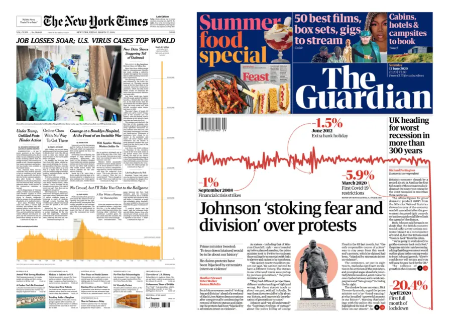
My mind is taken to the poignant New York Times front page from March 2020, highlighting Covid-19-driven job losses.
Or closer to home, when The Guardian highlighted the UK recession following the first national lockdown.
 While visualisations like this are less commonplace on front pages, they are by no means irregular across other media channels or in any environment where data is a driving factor.
The expression of data visualisation has manifested in various ways over the years; the rise of the dashboard was an interesting time for those of us in the industry.
One of my key principles for successful data visualisation is ‘less is more’. What does the user need to see? The answer to that is usually short, but with the availability of dashboard-creating tools, suddenly every team wants a dashboard. While there’s no doubt that this can be a useful tool to have at one’s disposal, more often than not, it’s completely unnecessary.
The power of a well-designed visualisation lies in removing the user's need to drill down and filter through data to find the answer they want. It does exactly that on the user's behalf, by answering the question they’re interested in. With dashboards, the whole idea is to display a lot on one page, and this isn’t always best practice.
One of the newest trends in the data world is self-service capability. Putting the power back into the hands of the user or customer is invaluable. However, with more people able to exploit the data and provide insights, the most meaningful insights are at risk of being lost or missed completely.
Therefore, to correctly communicate a data story, this trifecta of requirements should be addressed:
The data
The visualisation
The narrative
Independent members of a team could provide each individual element, but without collaboration and coordination across all three, insights can get lost.
The data in a model or table is useless to many without a visual to show what’s actually going on.
And yes, effective data visualisation can then tell most of the story.
But it’s easy to forget that this provides no structure. We may see a line chart showing data over time, but how much context do we lose without more information about this timeline? How much can you really include in the annotations?
So, we absolutely need the narrative.
Combining all three elements makes for a well-versed audience. They can finish reading the narrative with an idea of the source and the methods of collection and processing, as well as an indication of cause and effect.
Humans are emotional people. You could show someone the recession line chart from The Guardian and they can walk away informed. But you could explain to them what this actually means – what could happen to the value of the pound, how their food could get more expensive while their house becomes less valuable, how some will struggle and others will prosper.
Equipped with this narrative, the reader walks away engaged – and you never know, they might just communicate the data to someone else too. Apply this same method in business and you have stakeholders who are invested, informed, and literate about their own complex data insights. In turn, this helps to further improve data literacy.
This is the power of a well-told data story. For that reason, we should expect to see much more of this – not just in the media, but in the way that businesses communicate insights too.
Find out how InsightMaker helps organisations discover data insights.
Stay in the know with updates, articles, and events from Aiimi.
Discover more from Aiimi - we’ll keep you updated with our latest thought leadership, product news, and research reports, direct to your inbox.
You may unsubscribe from these communications at any time. For information about our commitment to protecting your information, please review our Privacy Policy.